Brand identity


GAIN logo

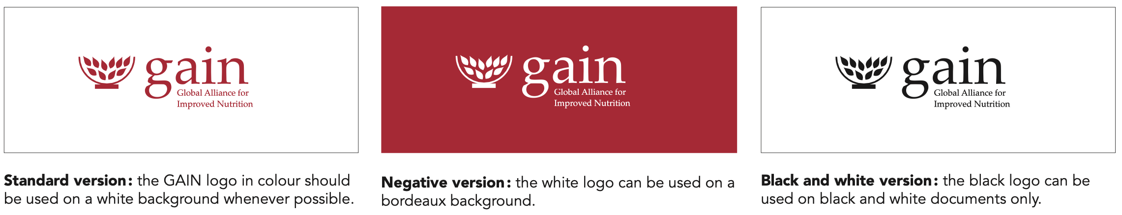
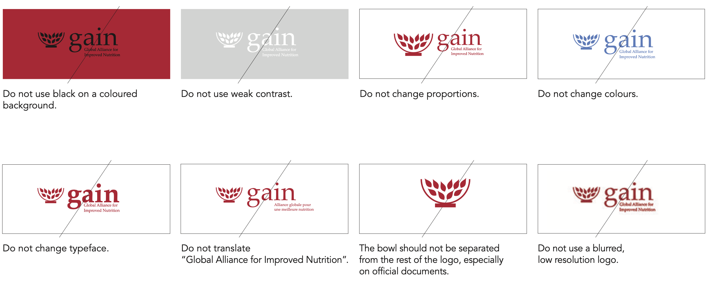
The GAIN logo should always be displayed in such a way as to ensure that the words “Global Alliance for Improved Nutrition” are legible. In exceptional circumstances - where space is restricted, for example on the spine of a book - the bowl of grain and the acronym “GAIN” can be used without fully spelling out the name of the Foundation.

The different variants of the GAIN logo are available below. Please contact the communications team at communications@gainhealth.org for permission and guidelines before using the GAIN logo in any capacity.

You can also download the full Brand guideline (40.1 MB).

PRIMARY COLOURS

Bordeaux and white are our primary colours. The white became a primary colour within our palette in order to have more white spaces on backgrounds and reduce “noise”.


BORDEAUX PANTONE 201
CMYK: 0-100-63-29
RGB: 178-9-51
HEX: #b20933


WHITE
CMYK: 0-0-0-0

RGB: 255-255-255
HEX: #ffffff

SECONDARY COLOURS

These should be used as additional colours for text boxes, infographics, charts, maps, icons, etc. Secondary colours can also be used as backgrounds.


PANTONE 7501C
CMYK: 13-16-30-0
RGB: 228-212-186
HEX: #d9c89e


PANTONE 4665C
CMYK: 27-38-54-0
RGB: 197-161-124
HEX: #c6a27d


PANTONE 7C
CMYK: 0-0-0-37
RGB: 183-184-184
HEX: #b9b8b8


PANTONE 427C
CMYK: 18-13-15-0
RGB: 216-216-214
HEX: #d9d8d7

Do's

Wherever possible, the GAIN logo should be presented in colour on a white background. It is acceptable for the logo to be reversed out on a coloured background and for the logo to appear in white. The GAIN logo can appear in black only on a black and white document. No other colour should be used for the GAIN logo.

GAIN logo colors


Don'ts

Never change proportions, colours, typefaces or language of the logotype. Examples of unacceptable use of the GAIN logo:

Dos's and don'ts


KEY MESSAGES
Book Antiqua (Bold)

Improving people’s diets to reduce malnutrition.

Book Antiqua should be used for key messages only and always in Bold. You can highlight keywords in bordeaux for greater impact. This font is available on all Microsoft programmes (Word, Excel, PowerPoint, etc).

TITLES
Avenir Black (or Arial Bold)

THE MARKETPLACE RWANDA

SUBTITLES
Avenir Black (or Arial Bold)

THE MARKETPLACE RWANDA

TEXT
Avenir Book (or Arial)

Lorem ipsum dolor sit amet, ad his vidit facilisis, veri probatus petentium vim at. Alii dolorem singulis at mei. Interesset interpretaris ut mei, pro vidit harum maluisset te.

Titles and subtitles : use uppercase for short titles (less than 50 characters including spaces). If more than 50 characters, use lowercase.

Colours: the text should generally be black on a white background. The red bordeaux is used to highlight keywords in key messages and titles only.

Fonts: for titles and subtitles we use Avenir Black and for normal text we use Avenir Book. Both fonts can be downloaded from the web on PCs. If you can’t download these fonts, please use Arial Bold for titles and subtitles, and regular Arial for normal text.

Style: please do not “justify” text. All texts should be aligned to the left.